Robert Clear

Artist from London

Goodwill is all

Robert ClearComment

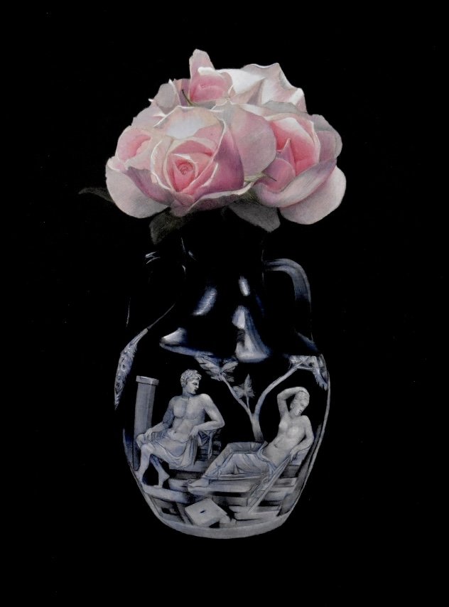
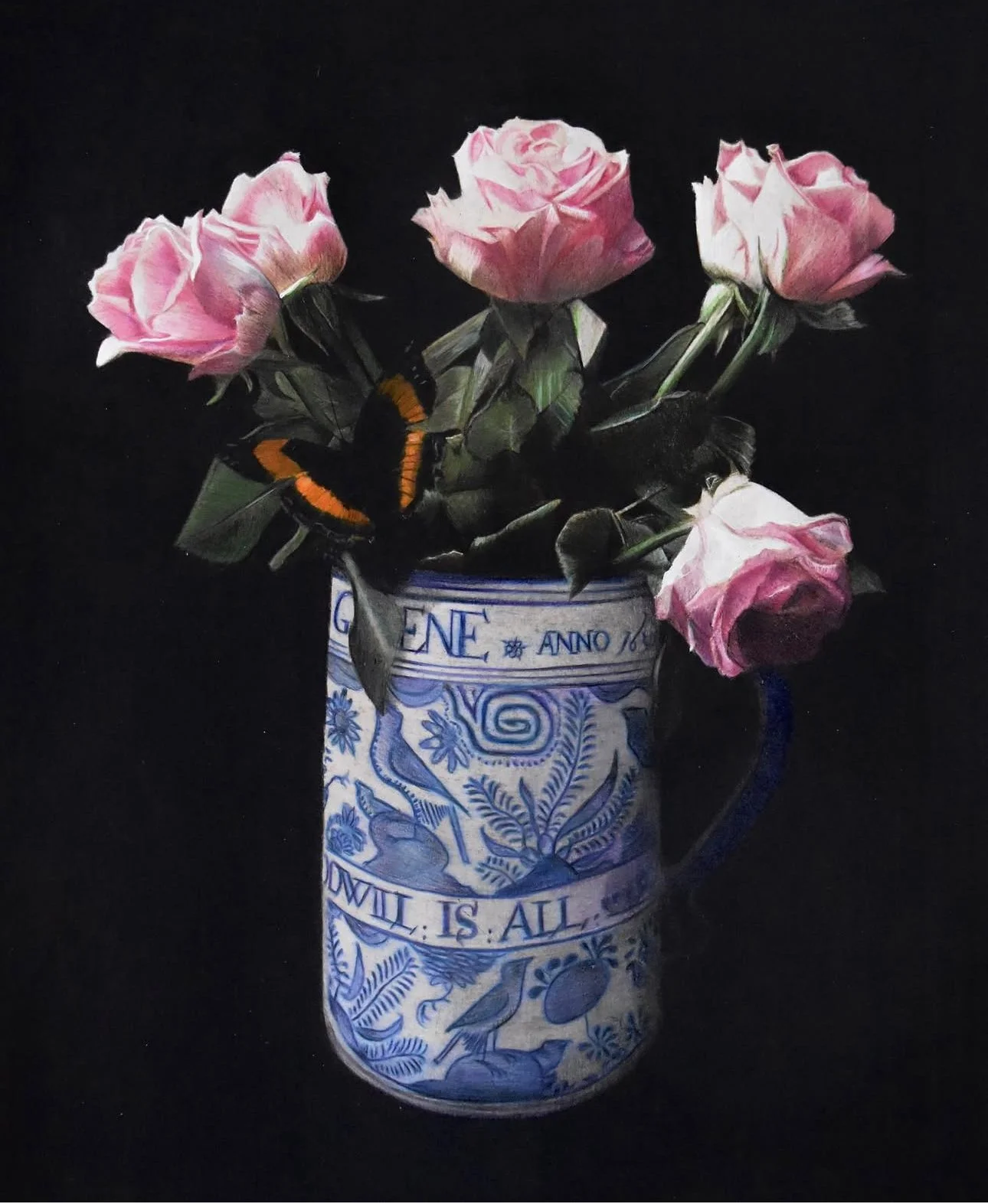
One day several years ago, when I was visiting the Museum of London, I saw an artefact that would plant a seed in my imagination that’s only recently begun to germinate.

It was a seventeenth century white and blue ceramic tankard with stylised nature motifs. It’s a form that’s characteristic of the period, and I’d seen them in museums before. But a particular feature of this one gave me pause. In a band along the centre of its body ran a striking message:

THE GIFT IS SMALL GOODWILL IS ALL.

The beautiful simplicity of the words and their harmony with the design on the tankard was striking. The text and the imagery joined to create a world played out on the surface of the vessel.

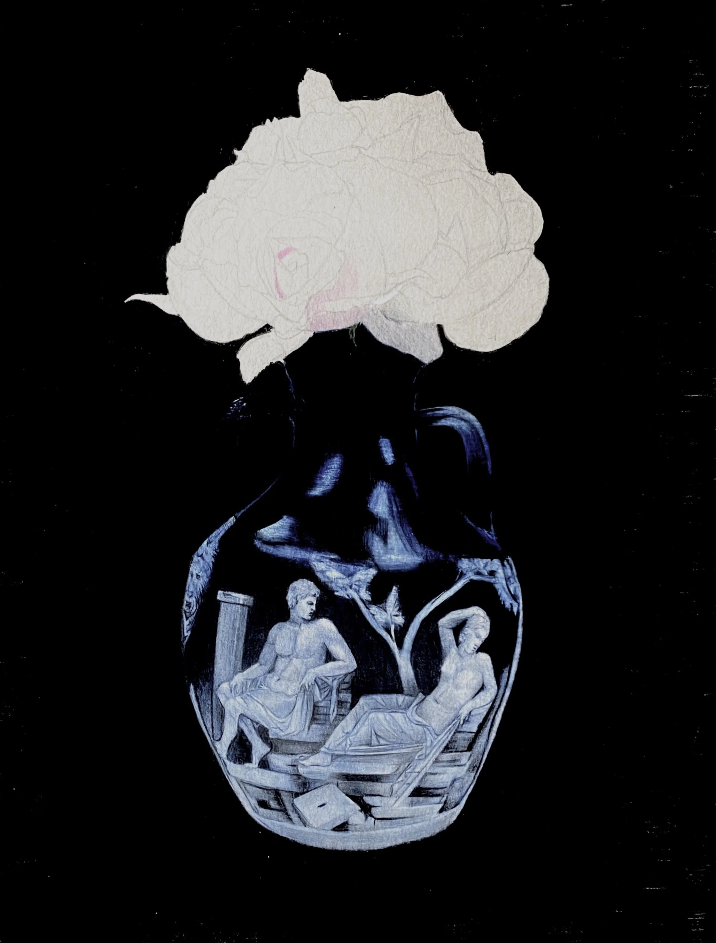
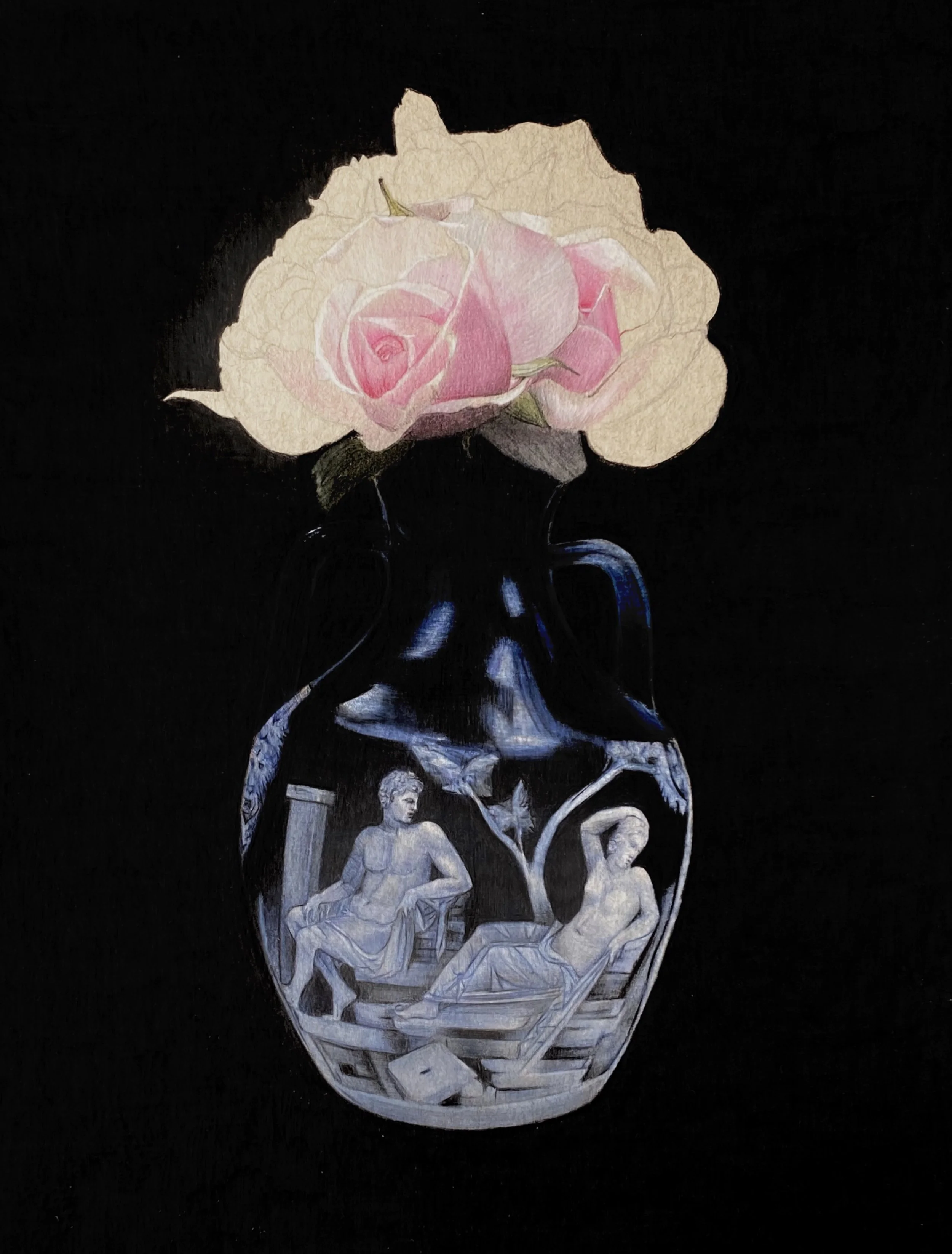
My instinctive response was to capture it in a drawing, and it was this that led to my series of black background still life pieces. In this case I paired it with a butterfly and a bunch of pink roses I’d seen at a friend’s house.

But the idea of a message, a piece of text on a ceramic object, stayed with me. Eventually (we’re talking several years later) I decided that I’d create such messages myself and that they would be love poems. There’s a sense of longing that tends to run through love poetry that seems dreamy to me in a way that’s somehow adjacent to the romance of that seventeenth century stoneware.

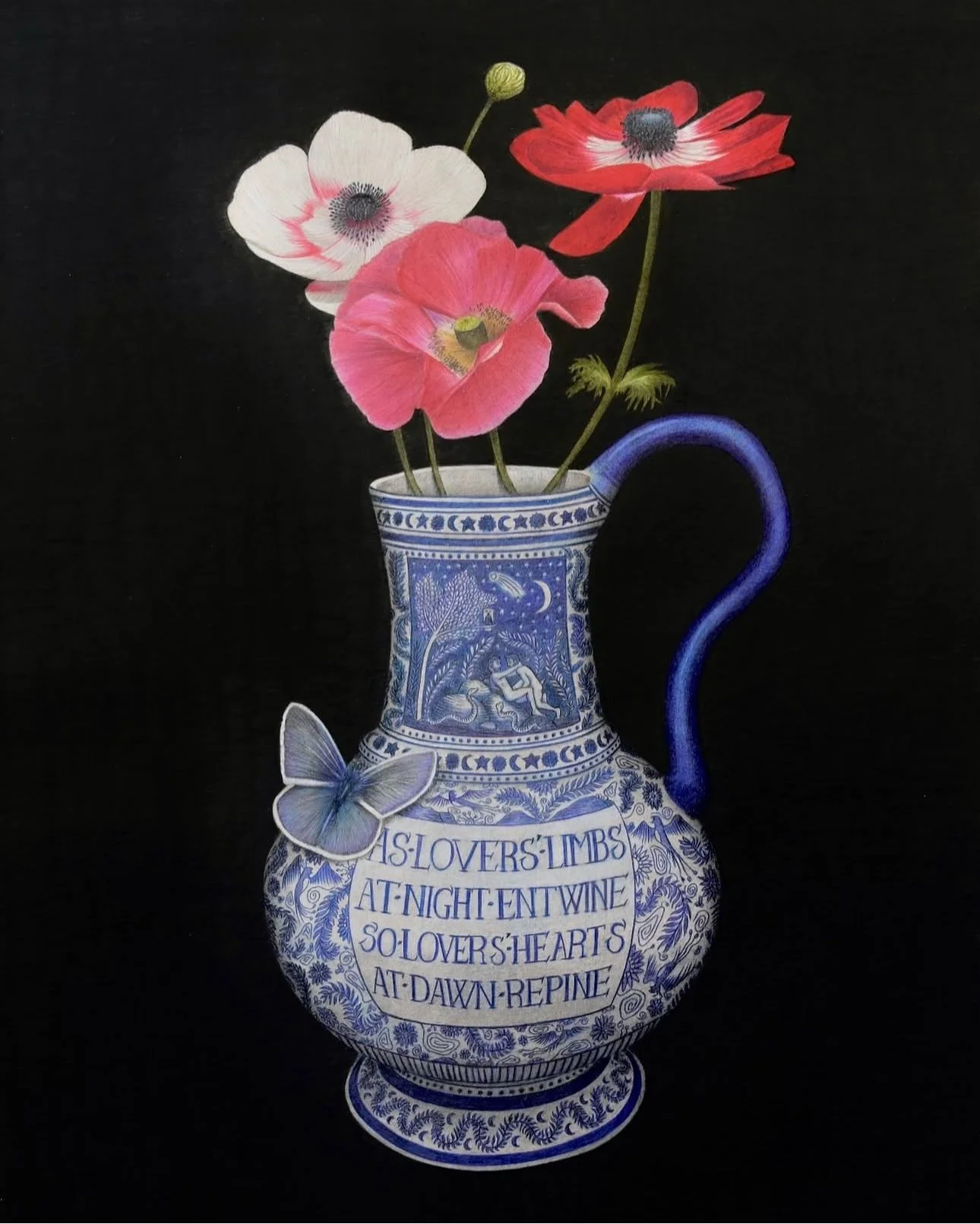
My first composition began with the poem itself:

As lovers’ hearts

At night entwine

So lovers’ hearts

At dawn repine

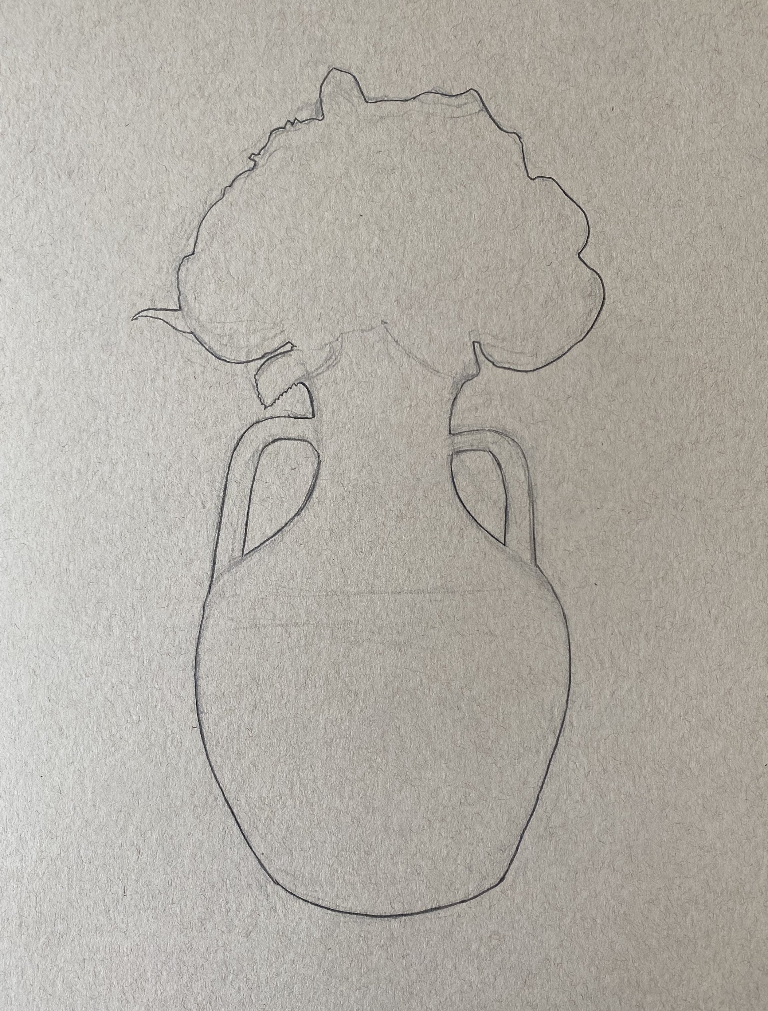
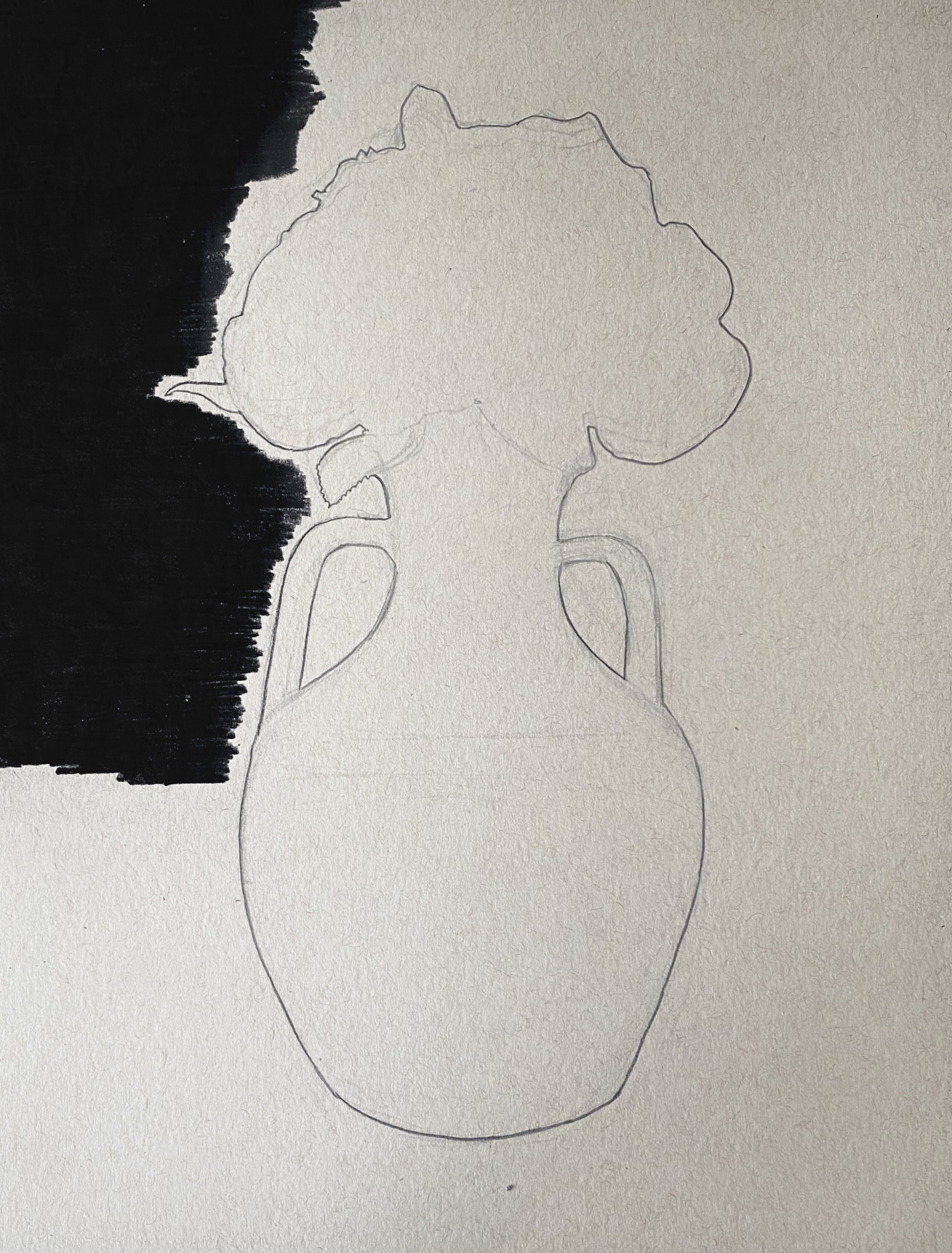
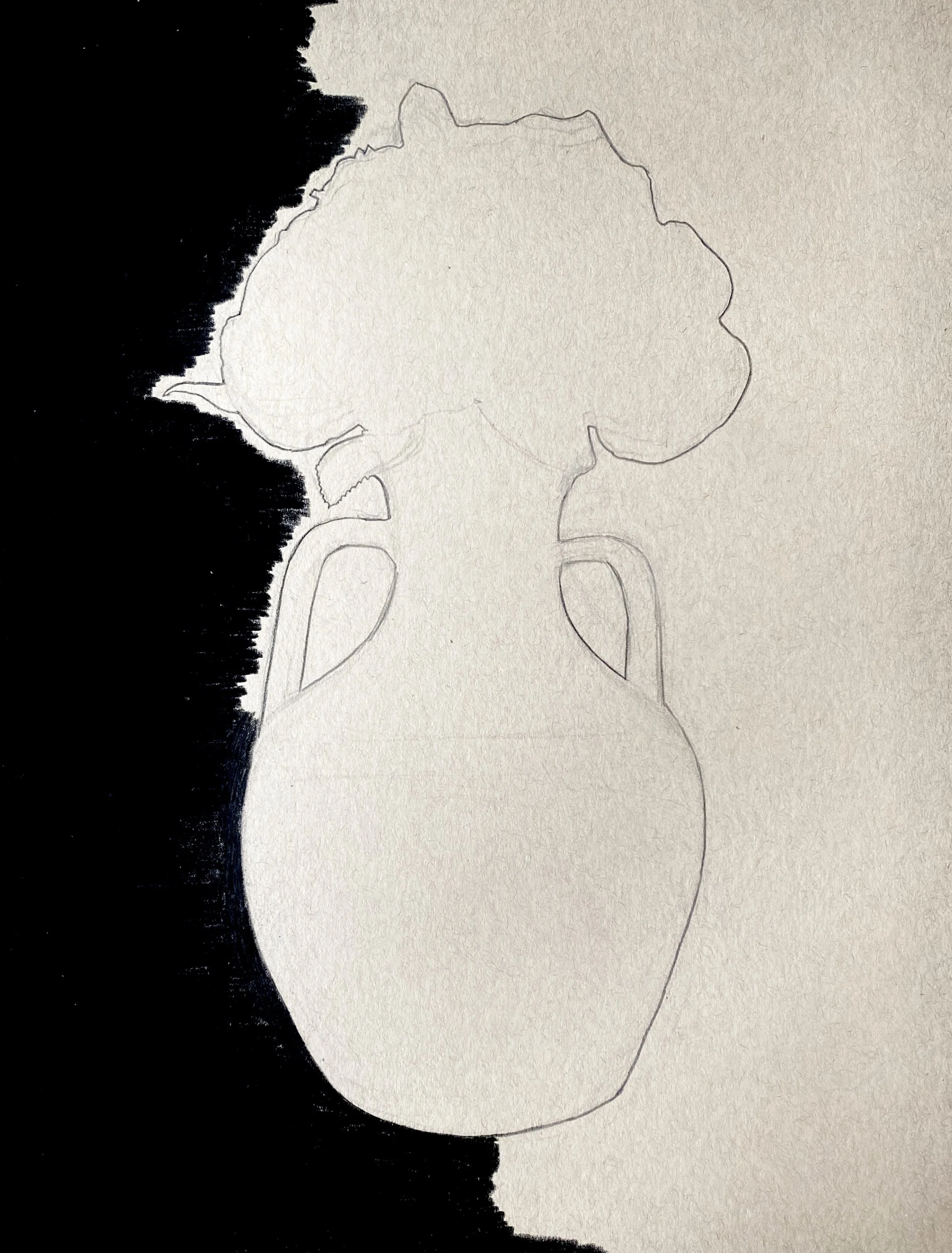
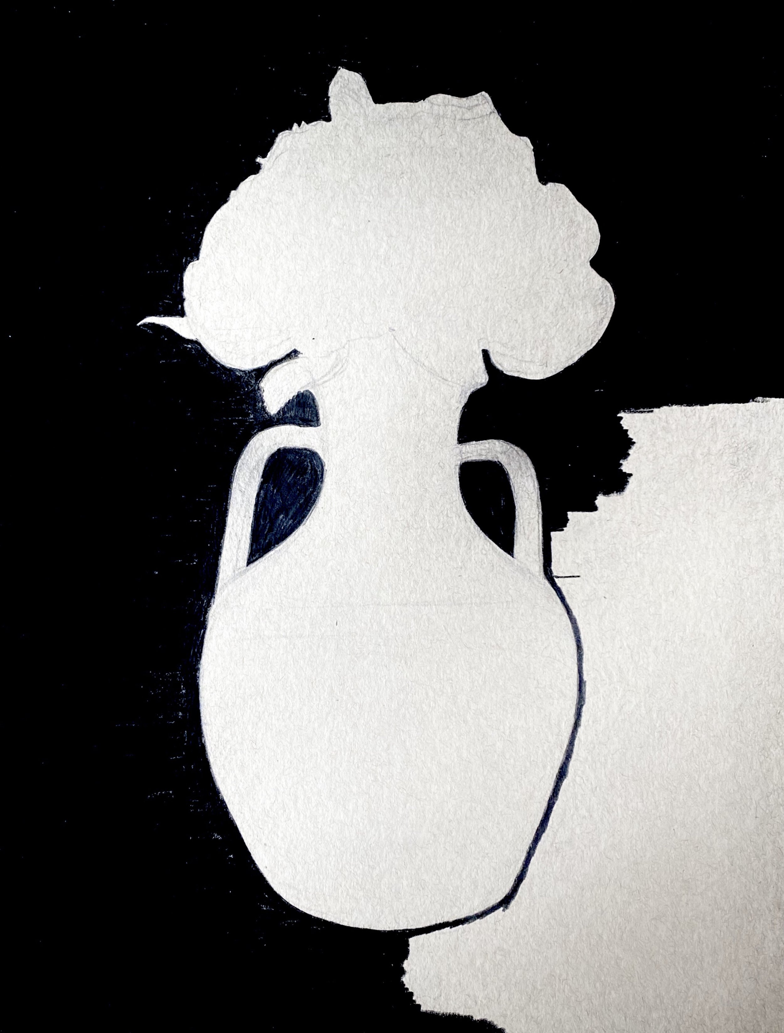
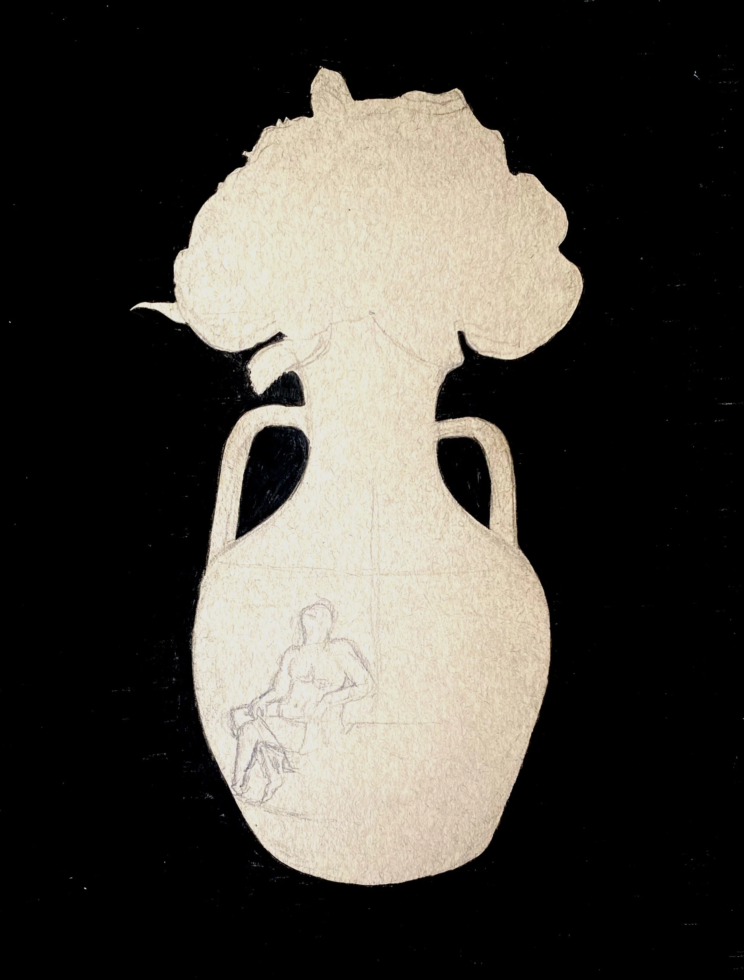
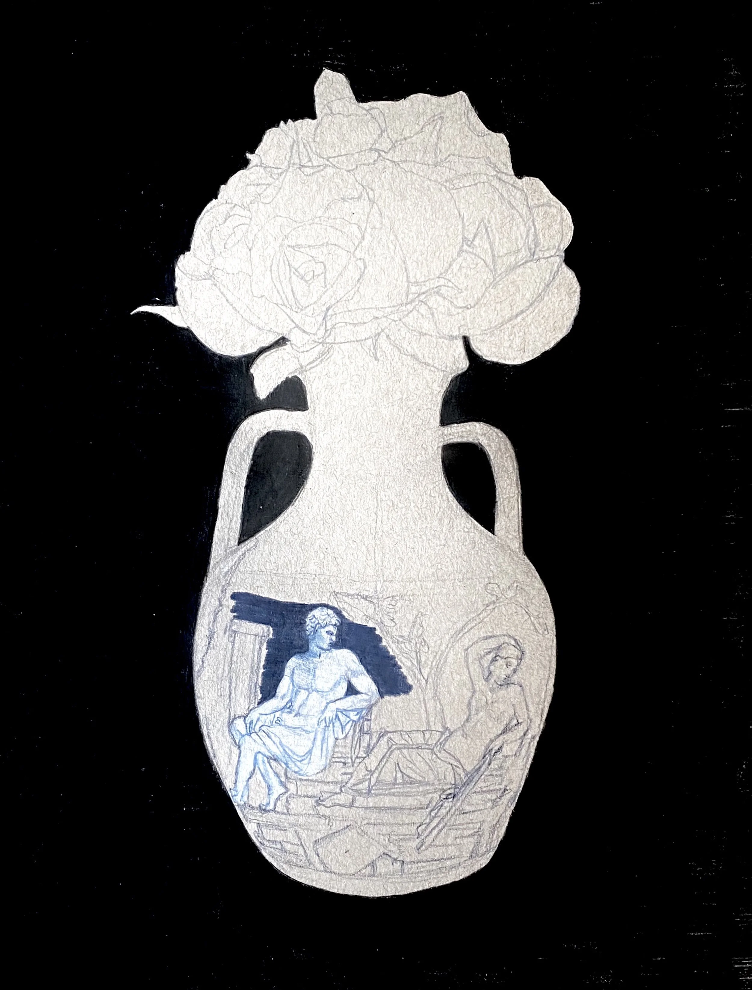
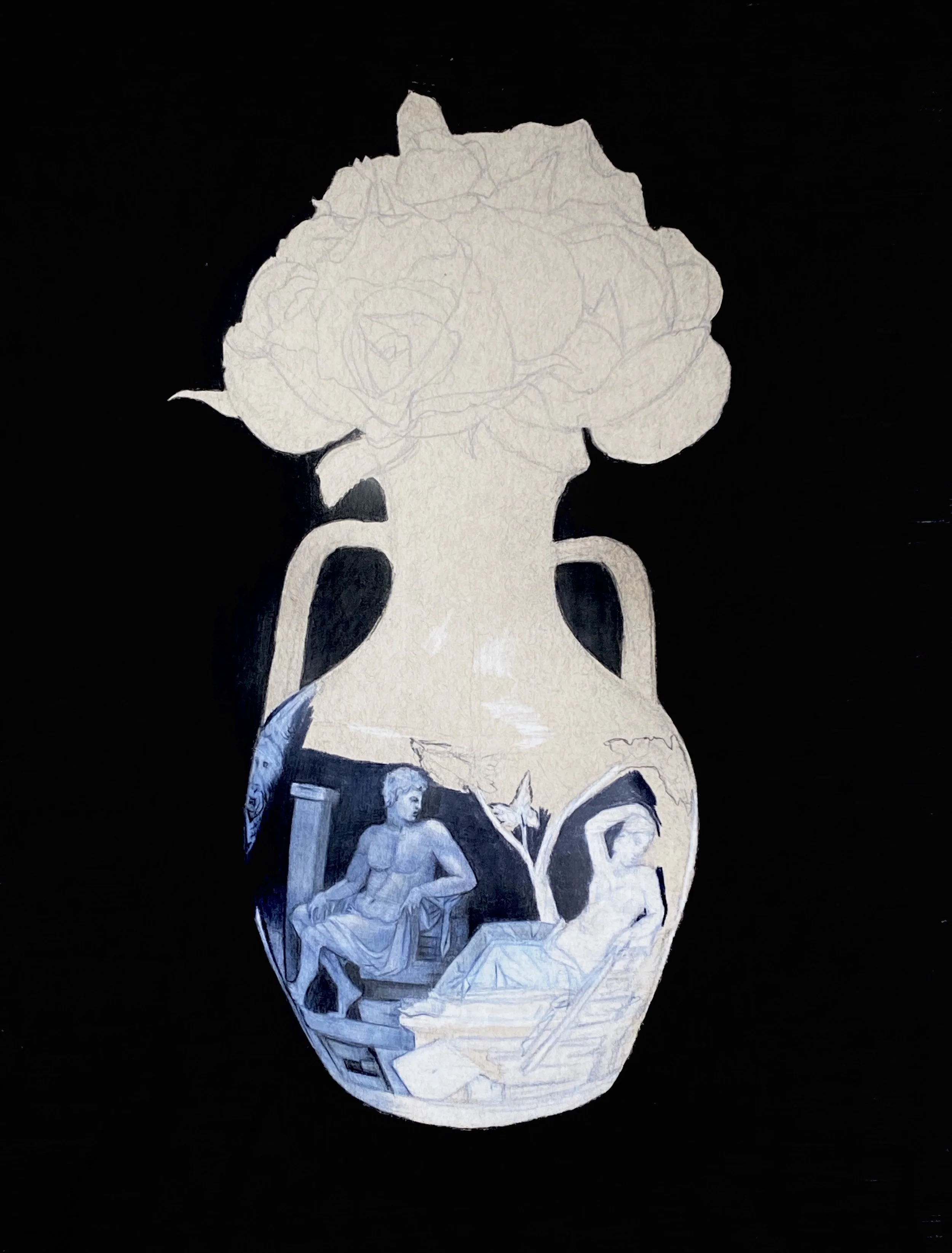
From here I designed the form and decoration of a jug to fit the verse, with twin figures coming together in a moonlit natural setting.

This led to the next piece, again beginning with a poem:

Should your love die

Grass will be my sky

Here I invented a vase with decoration in red and green. And I decided to feature myself this time, appearing as the abandoned lover, physically and symbolically placed below the grass, in the lower section of the vase.

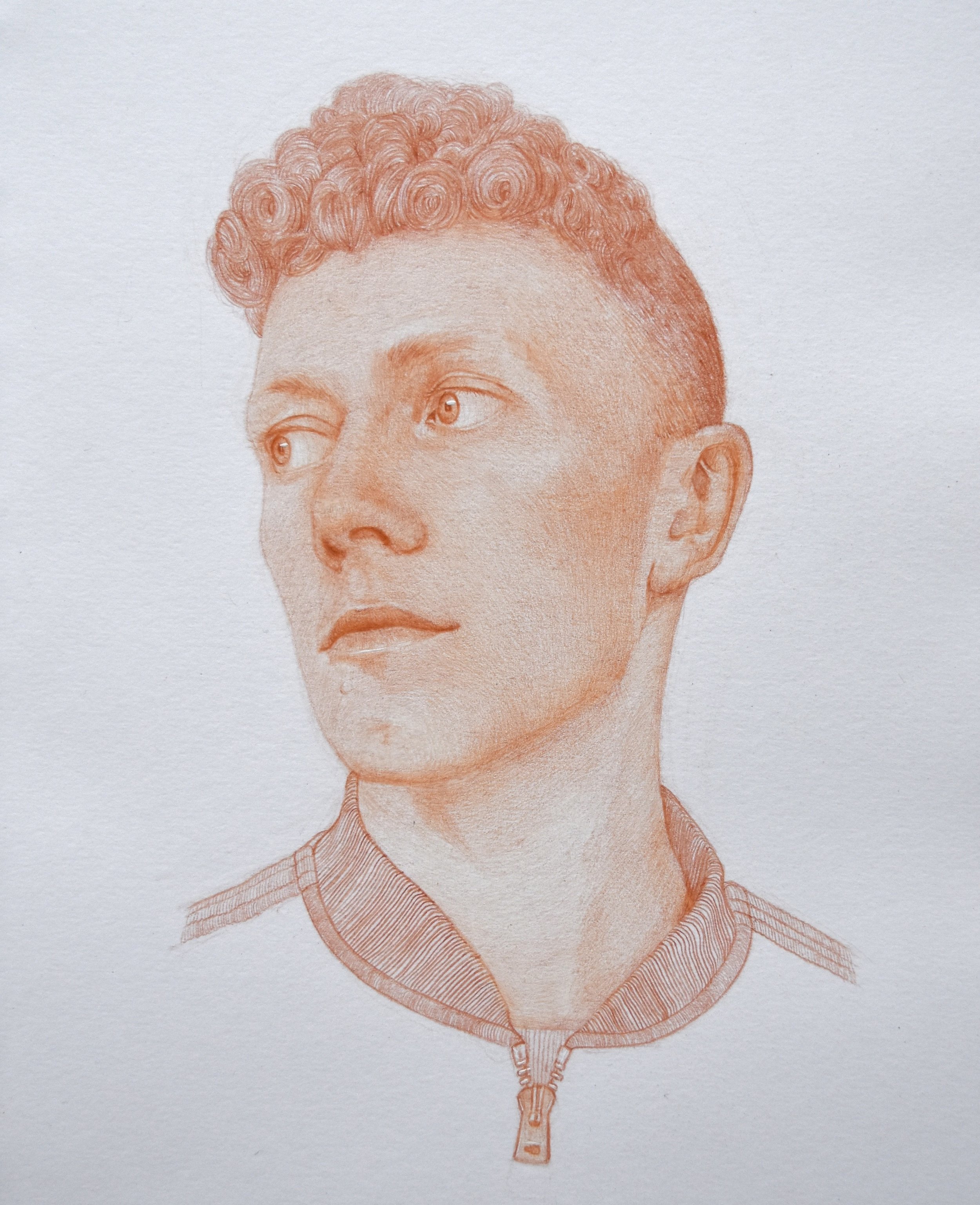
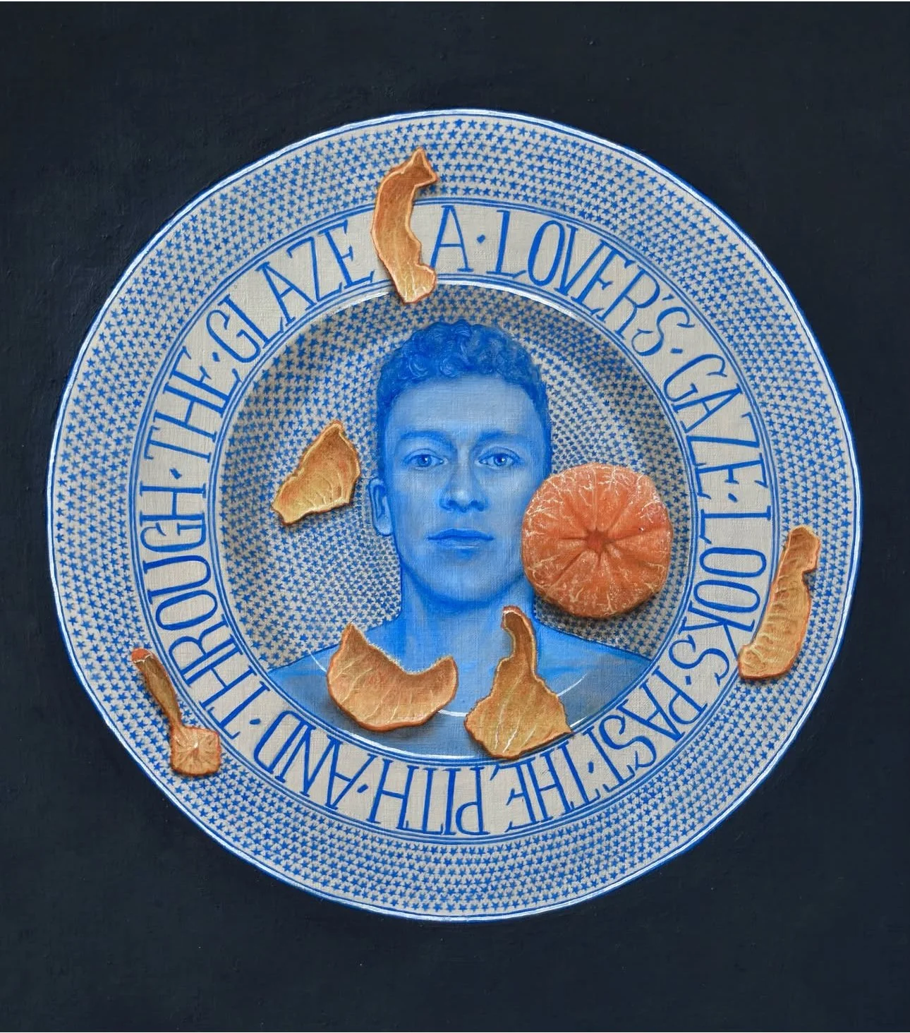
For the third piece I decided to create a painting in oil on egg tempera and acrylic. Again I featured my own portrait. The verse that formed the inspiration for the composition is:

A lover’s gaze

Looks past the pith

And through the glaze

This time I wanted to invert my role in the drama. Whereas previously I was the abandoned lover implied in the poem on the vase, here with the presence of the peeled satsuma it is the viewer who takes on the role of the imaginary lover, looking past the pith of the citrus fruit and through the glaze of the plate.

Now that I have three pieces under my belt I’ve decided to experiment with different ceramic forms. I’m currently working on the next composition, which will feature a pair of invented candle sticks, each bearing one half of a new poem. They really do need to be candle sticks as this directly relates to the text I’ve written. The challenge will be to make it fit comfortably on their surfaces.

I’ll have to put my seventeenth century thinking cap on.

Hidden in plain sight

Robert ClearComment

One of the challenges of displaying artwork online is that the surface texture of the work can be difficult to capture in photographs. I’ve found this is particularly the case with my still life drawings, many of which are set against a dark background. People have sometimes asked me what kind of black paper I use, when in fact almost all of them are drawn on light brown paper which I then colour with black pencil. My purpose in this is to create a unity of surface across the background and the subject, so that what appears to be a black ‘void’ is in fact a mass. I do this by creating a matrix of very dense, vertical-horizontal crosshatching. These form a pattern which, though not necessarily obvious at first glance, is as much a part of the composition as the detailing on the still life scene. This is one of the features of my work that’s particularly difficult to convey in photos, and doubly so in contexts where the pictures appear as thumbnails.

Here’s an example from my portfolio: a still life drawing of the Portland Vase (a piece of Roman glassware in the British Museum collection, which you can read more about here).

And here’s a set of progress shots, where you can see how I block out the background in sections before embarking on the vase and the flowers:

Hopefully this gives a sense of how the massed black pencil imparts vitality to the colours of the still life, and also how the vase and flowers become part of the body of the background itself as the drawing progresses.

There is one piece from several years ago which I drew on black paper: a plaster cast of the ‘Belvedere Torso’ from the collection of the Ashmolean Museum in Oxford.

Here we’re faced with a different version of the same problem, in that the texture of the paper is reduced to a block of black. Although that’s truer to life in this case, since the paper I used here is very smooth and matte.

So the conclusion is one that was obvious from the beginning, which is that the only way to appreciate the texture and surface details, which are so crucial to sense of artworks as objects, is to view them in person.

Side project

Robert ClearComment

In addition to the portrait of Charles that I’m working on right now (part of the ‘Reading Men’ series that I mentioned in yesterday’s post), I’m also turning my mind to another venture, one that I’ve been working on as a side project for a few years: my book of male head portraits. There are sixteen so far, with at least another 30 pages to fill (and it only recently occurred to me that five of the sitters are named John/Jonathan).

Here are some of the faces:

Drawing amidst turbulence

Robert ClearComment

It’s been a turbulent day of intermittent downpours and sunshine in London today. Fortunately, though, I’ve been able to spend it at the drawing board with nothing to take me outside. I dedicated last week to overhauling the website, and now that the task is (largely) complete I’ve been able to return to the analogue joy of pencils and paper. I’m currently working on a portrait for my new series, ‘Reading Men.’ It’s a group of semi-nude male figure drawings, where each subject is holding a book from their own collection. I never ask why they’ve chosen their specific title, as I want there to be a kernel of mystery, both for me and the viewer, at the core of each piece, which otherwise lays the individual almost entirely bare.

The series so far comprises four portraits: Pythagoras (with Ocean Vuong’s ‘Emperor of Gladness), Jacob (with Seán Hewitt‘s ‘Open Heaven’), AJ (with Russell Tovey and Robert Diament’s ‘talk ART’) and René (with Albert Camus’ ‘The Stranger). Of these, Pythagoras and Jacob are now in a private art collection, whilst the originals of Jacob and René are for sale here on the website (and in Jacob’s case are one of the first three prints in my new reproductions series). The portrait in progress is of Charles, who lives in Paris, and I’m hoping to finish sometime next week.